By SCOTT GEIGER
1.
The modern novel is probably an unintended consequence of nineteenth-century European cities. James Wood glosses the idea in his handbook How Fiction Works. The breakthrough narration in Madame Bovary, for instance, a stylish authorial voice that seemingly dissolves into the consciousness of its subjects on a wash of image and detail, corresponds to a boom in European industrial urbanism. Its vector is the flâneur: the young and loitering, the unemployable café-sitters, the arcade-browsers. These onlookers adapted their eyes to the city’s “large, bewilderingly various amounts of detail,” says Wood.
If novels evolved to show and not tell as European writers began depicting a new way of life in cities, there are likely a few Ph.D.s to be earned diagnosing the role U.S. cities of the mid- to late-twentieth century played in producing postmodern American literature. The advent of new technologies, consumerism, cultural pluralism, and the Internet nest within a broader national experience of our built environment. For generations now, we have been painfully missing what Sarah Williams Goldhagen has called “some kind of arena, typically physical, in which a large number of people—different people—regularly interact.”
2.
These decades of postmodernism have complicated and fortified American literature. Its inheritors, our present and future novelists, are now entering a century of ambitious new urbanism.A few really significant projects that have come to light in the past couple years indicate a new direction for cities.
Chicago’s incredible Millennium Park, now almost ten years old, led the way with a marvelous collection of landscape, architecture, and public art. The city will build on that success with a massive renovation of its Navy Pier. The reclaimed infrastructure at High Line Park, Brooklyn Bridge Park, and the Governors Island (see February’s Buckminster) are still in progress but are already beloved by New Yorkers. St. Louis’s CityArchRiver2015 project will produce a vast new park on both sides of the Mississippi River to transform experience of its downtown landmark, Eero Saarinen’s Gateway Arch. I exclude an immense new “blue edge” for Lake Ontario, a collection of projects administered by Waterfront Toronto, only to abide by my own geographical limitations.
I’m interested in all of these projects for their future economic and social impact as well as the landscape urbanism of their design. But I’m especially intrigued by the cultural valence the advent of these project holds.
Designs for such large public projects often develop through high profile competitions. This is a legal requirement in some cities. Elsewhere, such processes serve the practical purpose of aligning widespread support among constituencies who are able to review multiple options or approaches. A city will invite a select group of architects or landscape architects, who study the opportunity in collaboration with consulting engineers and specialists. These teams generate comprehensive design proposals for public presentations. Each design team works to persuade the population of a future made possible by their specific vision.
In 2011, the Florida city of St. Petersburg advertised for designers to address their major downtown landmark, a century-old municipal pier terminating in a nautical-looking inverted white pyramid that had been constructed in 1973 renovation. It was a shopping mall and food court, a failure as a destination. From a competitive auditioning field, St. Petersburg short-listed teams led by Bjarke Ingels Group (BIG) from Copenhagen/New York; Michael Maltzan Architecture from Los Angeles; and West 8 from Rotterdam/New York. St. Petersburg’s competition process is notable for the quality of the proposals and for the extent to which its materials are now publicly available online.
3.
I want to make the case that the architectural speculation performed for the St. Petersburg Pier competition, and for many projects like it, produces documents that constitute a significant if somewhat specialized literary form. It’s a literature of doubles. Graphics work alongside text for two contradictory audiences: professionals with highly technical interests and concerned citizenry. Significantly, the form hybridizes fiction and nonfiction into something new and rare and important.
Schemes proposed in fall 2011 originated in a very close study of parameters issued by the city. The pier designs are expressions of these dimensions. St. Petersburg requested a landmark icon with a year-round complement of rewarding experiences for the public. But this new landmark had to fit a defined buildable area. There were environmental standards and city permitting requirements. Something had to be done to the existing pier. A glide path to a waterfront airport cannot be obstructed. Revenue should be pursued, government subsidies resisted. Do not diminish a popular beach adjacent to the pier. Most importantly, the design must project a new identity for St. Petersburg. Instead of a shining ornament (or shopping center) out at sea, the Pier should incorporate an iconic experience into daily life downtown.
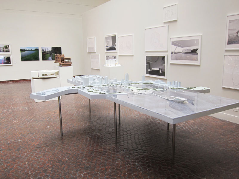
Aspirations pose nude in the proposal titles, nouns too delicate for the level of effort and amount of time consumed in creating proposals of this quality. Each no doubt stood upon a body of data and detail accumulated during a process involving two or three dozen individuals across many professions, from economists to ecologists to traffic engineers, all projecting the future impact on St. Petersburg. Curating so much material to mount one coherent narrative—presented to the jury, printed in books, and exhibited as a series of models and posters—is a feat of tremendous discipline and collaboration.
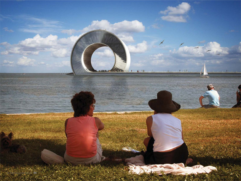
The Wave by Bjarke Ingels Group (BIG) with Mesh Architecture and Fabrication offers a three-part proposal whose landscape and public spaces maximize recreational activities along the pier and beaches but culminates in an unexpected public space-as-building. A sense of inevitability to the book’s rhetoric breaks down as BIG speculates about possible tenants and programs for The Wave, including a Water Cycle Museum. The moody renderings and formal manipulations suggest a fantastical, parallel world.
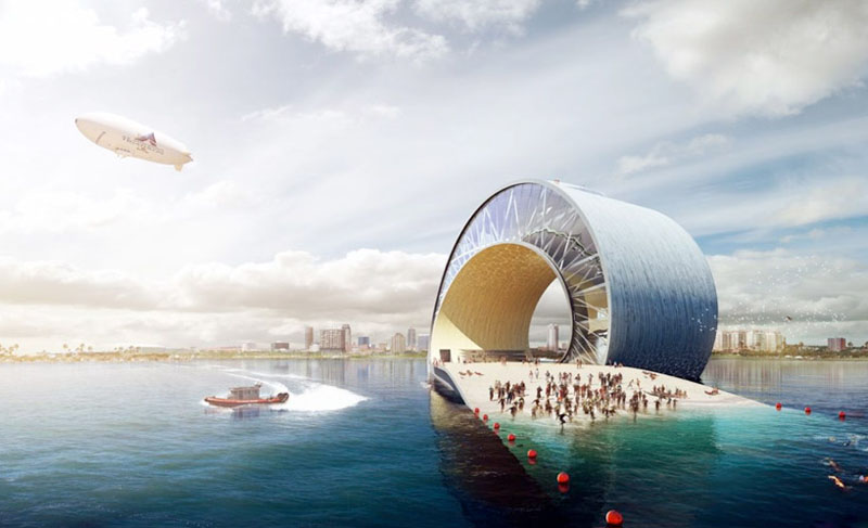
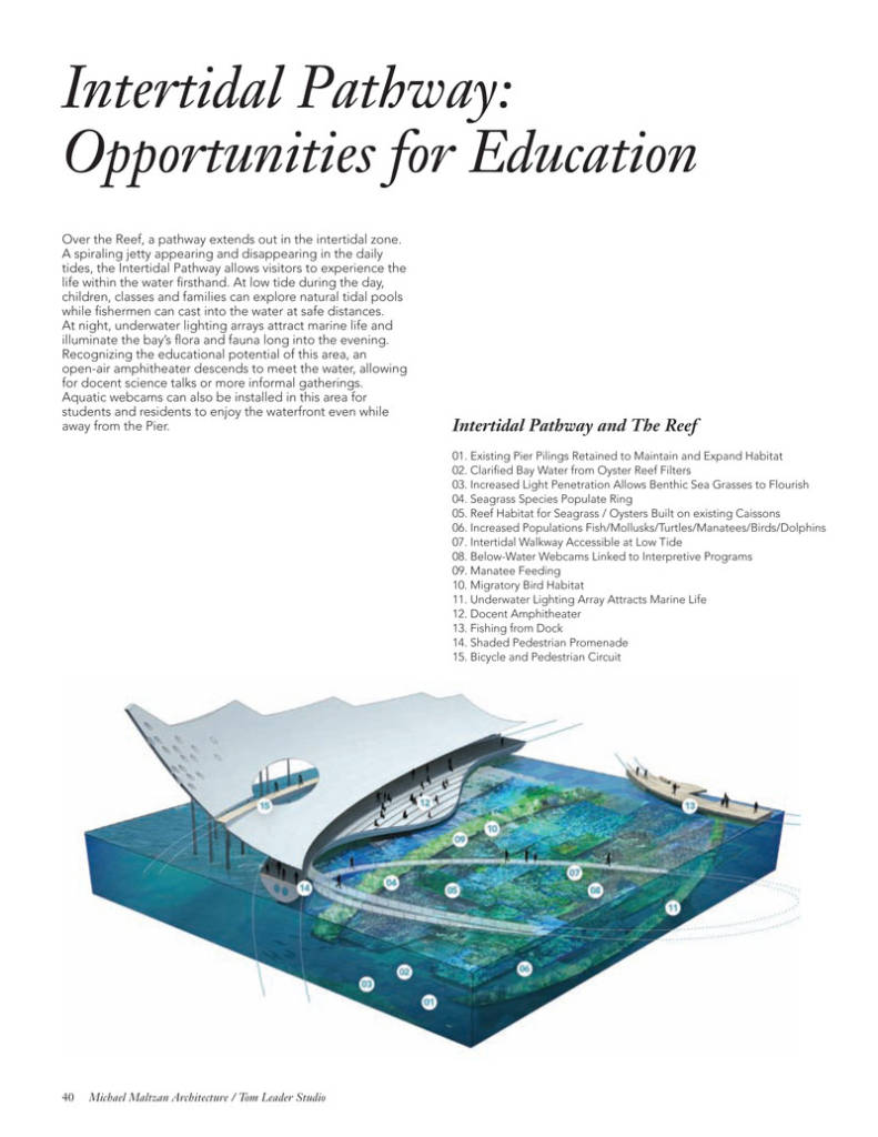
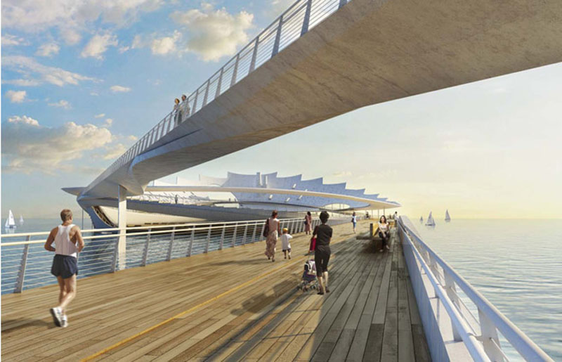
The Lens by Michael Maltzan Architecture with Tom Leader Studio is a lyric antidote to BIG’s epic. This proposal leaves its measure of public program ashore to replace the pier with twin fly-away bridges mounting a long, elliptical sculpture suggestive of a sail or a fabric canopy. An elevated promontory penetrating the canopy looks out to Tampa Bay while the circuit of pathways inside views the St Petersburg skyline. A circular harbor opens to boaters. An artificial reef built on the ruins of the current pier is at the center of the Lens. Manatees lunch on sea grasses in cobalt-rendered waters above the white brilliance of concrete. Piece-by-piece explanations of the project’s components, using rendered diagrams, are the most effective elements in a book that also includes pen sketches, model photography, and extensive writings.
The Eye by West 8 with Holmes Hepner and Associates derives a strange biomimicry from very a cautious consideration of the project goals. The strategy here is clearly to rehabilitate the legacy of the historic pier (from 1926) as sustainably and as inexpensively as possible. An elevated concrete pier, fortified against hurricanes and sea-level rise, lasers right out to a new man-made sand bar, or Downtown Shoals. The project is carefully reasoned from the perspective of landscape, even the Eye itself. Appropriating the form of a sea urchin, this pavilion cools beachgoers with considerable shade and ocean breezes. It’s an enormous empty seashell, though, and, up against this field, West 8 is outclassed.
4.
On January 20, 2012, St. Petersburg’s jury unanimously voted to rank The Lens as the winning design. Along with the announcement, St. Petersburg released an independent, third-party review of the proposals that evaluated cost, constructability, environmental impact, and revenue/subsidy requirements. The city’s stated budget for the construction of the new pier was $50,000,000. Review of cost estimates submitted to the jury found footnotes and errors. The third-party cost estimates showed the designs rocketing over budget, cost estimates submitted to the jury.
Public comments from the presentations and an exhibit of the proposals also appear online, with comments filed in a spreadsheet of cells. They read like fortune cookie memos:
“VERY UNIQUE DESIGN. PEOPLE WILL SEE THIS AND SAY, OH YES, THAT’S ST. PETERSBURG.”
“REMEMBER THE OLD SPANISH PIER BUILDING? PLEASE TRY AGAIN!”
“IT WOULD PROBABLY BE USED BY TEENS AS A HANGOUT TO GET HOOKED—EASY DISPOSAL OF CONTRABAND.”
“WHY IS ST. PETE TRYING TO BE LIKE DUBAI?”
“NOT CONSIDERING THE LENGTH PEOPLE WOULD NEED TO WALK. NOT CONSIDERING IT AS A PLACE TO GET REFRESHMENTS/FOOD DESTINATION AFTER SUCH LONG WALK.”
“WHERE ARE THE DANCING GIRLS? ALREADY HAVE ONE ICONIC SPACESHIP ON DALE MABRY. THE SAND FILL IS AN ENVIRONMENTAL DISASTER!”
“THE POTENTIAL OF MARINE SCIENCE EDUCATION IN THE LENS IS A PLUS. DESIGN OF THE CROWN REMINDS ME OF DALI’S WORK.”
5.
How do you read the St. Petersburg Pier proposals?
Given that they are business instruments. Given that they are public relations appeals. Given that they are largely organized around photorealistic images of the designs rendered using a parametric modeling application called Rhino and Adobe Photoshop. Renderings exhibit the look and feel of the design as you might experience it in life. They strive to satisfy the public’s demand to know what it will be like, but they can also lead to indulgences. Renderings are therefore the most important element of this type of proposal and the least useful. The nod to Christopher Nolan’s science fiction thriller Inception in BIG’s proposal is only half hipster showmanship. To contemplate the future of our cities, we resort to filmic special effects. For instance, the vantages assumed in renderings are not always humanly attainable. West 8, at least, alludes to a pelican’s perspective. BIG and Maltzan have flattering aerial and at-sea views comparable to TV sports coverage.
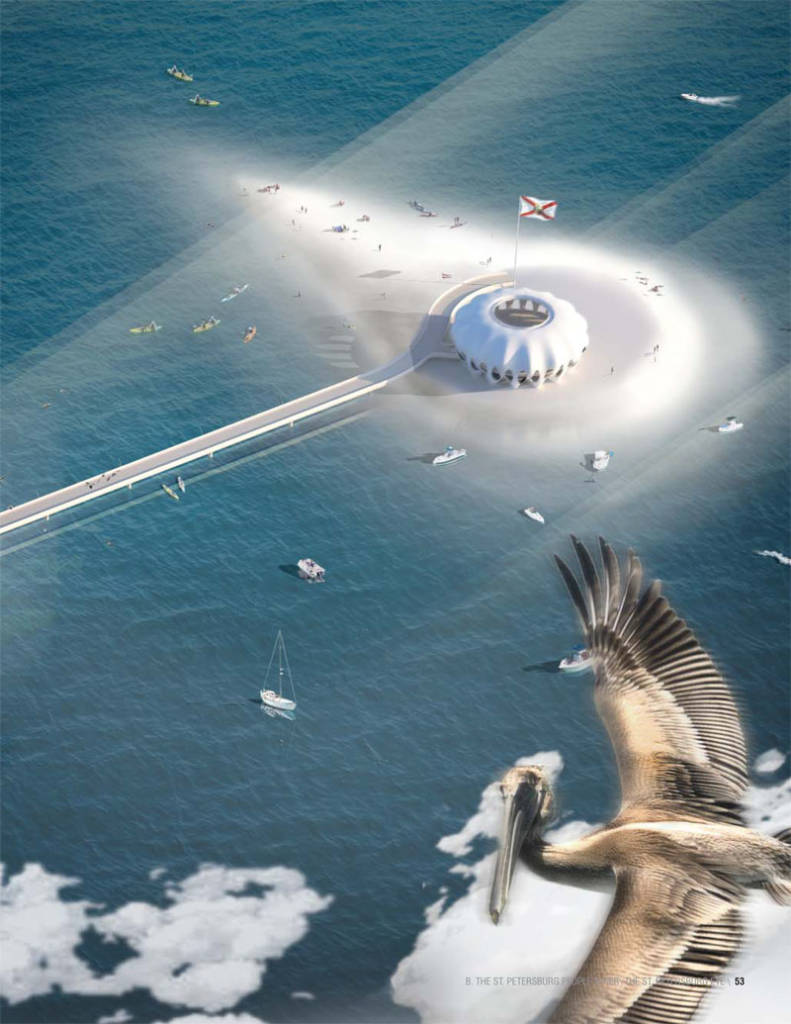
Up close, however, as seen from the surrounding beaches or out on The Lens loop, under The Wave’s crest, or inside the shady Eye, we glimpse an attractive, vibrant population. They’re families caring for children. They’re sunbathing and picnicking and fishing. Some swim while others practice tai chi. All of the proposals set their casts of extras against a novelistic mélange of city life. If The Wave, The Lens, and The Eye are literature, the stories they tell are set in a future in which a design (the plot of the story) transforms the life of a protagonist—you, the flâneur.
6.
Winning a design competition is only the beginning. The Lens is evolving as its architects continue to tune and refine their design around the city’s efforts to satisfy public concerns. Last November, another independent review of The Lens came in, this one from marine scientists tasked to evaluate the reef to be constructed among the demolished pilings of the existing pier. They found it infeasible: The waters of Tampa Bay are too dark to support the desired plant media and sea life. The Lens, which had originally had no revenue generating amenities, now includes two restaurants. A flythrough tour of the current design is available online.So is a video of a Tea Party-style counter-campaign trying to cancel the city’s contract with Maltzan.
 The existing St Petersburg Pier will close on May 31 for demolition.
Scott Geiger is the Architecture Editor for The Common. “Buckminster” is his monthly column.
Images courtesy of Bjarke Ingels Group (BIG), Michael Maltzan Architecture, and West 8.

